Home Page
Header row
Application menu
From the application menu you can switch between Vertex applications like MyVertex, Sync and Showroom.
Home button
To return to the home page from any other page, you can use the Sync logo as a home button. The Sync logo is a symbol that represents the Sync application. It is in the upper left corner of the screen, next to the address bar.

Search bar
The search bar is in the top center of the view. Detailed documentation of the search features can be read here.
Main menu
Click your profile icon to open the main menu.
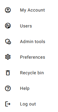
Admin tools option is available only for the Sync administrators of your organization. You can check the administrators from the Users lists.
View tabs
How to use the favorite, recently visited and recently worked on lists
Labels
The linked objects can be filtered by using the labels. Labels are located above the linked objects. Only the labels that can be found from the linked objects are visible. By clicking a label, only the objects that have that label are shown.
Main Object Grid and Row View
In the Sync application, each file is represented as an individual object. Sync has two primary views for displaying the objects: the grid view and the row view.
To alternate between the grid view and the row view, locate the ‘View’ button. This button is positioned as the second button from the right in the filter row. By clicking on the ‘View’ button, you can seamlessly switch between the two display modes. This allows for a customizable and user-friendly experience within the Sync application.

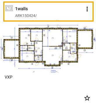
Object’s grid items header row contain object type icon, its name and context menu.
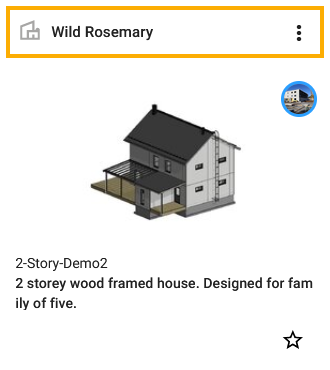
In the row view the object’s name the top most text.

If the object has a parent, the parent name is below the object’s name. Some objects may have multiple parents. In such case all parents are listed in hover tip.

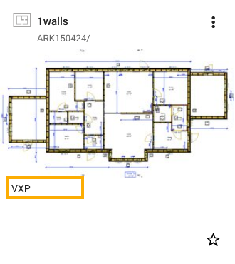
In Sync, each object may have a file attached. This file’s type is displayed beneath the object’s image or name. This allows for easy identification of the file type associated with each object. Please note that this file type is not available for objects categorized as ‘Buildings’.

In Sync ‘Building’ has a unique identifier known as a Building ID. This ID is displayed beneath the image of the building. Vertex BD, uses this Building ID to identificate the building.
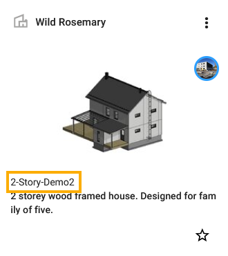
In row item the Building ID is under the object name.

The placement of the object’s description text varies depending on the item layout. The object’s description text is located at the bottom of each item on grid items. This allows users to first focus on the main content of the grid item and then read the additional details in the description. For row items, the object’s description text is positioned in the middle of each item. This central placement ensures that the description is easily noticeable and accessible to the user as they navigate through the row items.
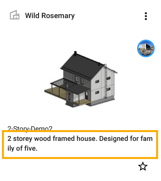

In some instances, due to space constraints, the description text might be truncated. This means that only a portion of the description is displayed on the screen. When you hover your mouse over the truncated description text, a hover tip (also known as a tooltip) appears. This hover tip displays the full description text.
Home page
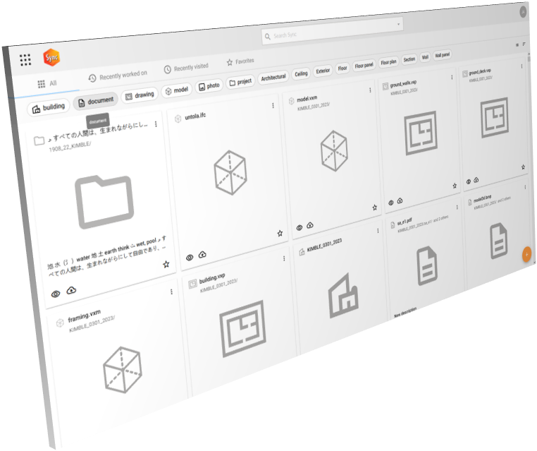
The new improved home page gives you access to all content in Sync. All objects are available and represented as object cards of their own. If you prefer a more traditional view you can switch from grid view to list view. List view gives more objects on screen at the same time. Use filtering to narrow down the number of objects or search to find information you are looking for fast and easily.
Mark objects as favorites and you can find them easily on the Favorites tab. You can find your latest works on the Recently worked on and Recently visited tabs.
Released in version 1.0.0-alpha
For Row Items, the object’s description text is positioned in the middle of each item. This central placement ensures that the description is easily noticeable and accessible to the user as they navigate through the row items.
